Tag Archives: Material Design

Apple Vs. Google: Who Will Win 2015?

With 2015 off to the races, we take a look ahead at what’s in store for the top tech companies this year.

APPLE

They say it’s not over until it’s over, however, Apple, the biggest tech powerhouse in the world, is unmerciful. Apple announced the first week of January broke their record for weekly billings with over half a billion dollars spent in the App Store on apps and in-app purchases.

2014 was a huge year for Apple. They released the iPhone 6, iOS 8, OS Yosemite, and, perhaps most important when we look forward at the coming year, Swift, a programming language designed specifically for iOS.

As we detailed previously in our article Swift Execution, Swift is the most beginner-friendly programming language and, as is custom with Apple products, received widespread adoption both by developers and tech curriculums. 2015 will be the year we see the beginnings of Swift’s impact and what developers are capable of doing using the language.

On the hardware side of things, there are rumors Apple will release a larger-screened iPad, a retina-displayed MacBook Air, and even potentially a new model of iPhone; however, one product is for sure: Apple Watch.

Apple Watch represents the first new Apple product since the iPad. It’s their first foray into wearables, along with the first wearable device expected to receive widespread adoption. We will cover this subject in-depth next week when we explore wearables. For now, what matters is that surveys say 18% of iPhone 6 owners will definitely buy the Apple Watch when it’s released, a number which will grow when the functionality of the device is better known. Shipments were recently announced to begin in April.

If any of this is any indication, 2015 will be a great year for Apple. It’s going to be tough for the competition to keep up.

GOOGLE

Google has its work cut out for them. Expect the release of a new OS, however, it’s more likely it will be an update for Lollipop than a major upgrade considering the impact of material design.

One of the big projects Google has coming in some form in 2015 is Project Ara, a product development concept in which the owner of a smartphone can upgrade specific parts of the phone, such as the camera, or processor. PC Advisor likens it to Legos. Although there’s no set release date, Google has said they plan on introducing in some stage in 2015.

Google recently announced they are pulling Google Glass from the market in its current form. While many are trying to spin this into a failure (specifically this hilarious C-NET article), Google insists the withdrawal is actually the next step of the Google Glass program. They have held steady Google Glass was in a beta stage are still developing the product. One cannot deny the potential impact of a year’s worth of usage on the research process. Though no official date has been released, the new product will likely compete with the Apple Watch either later this year, or early next year.

Aside from Project Ara and Google Glass, expect new Android TV, Android Auto, and Android Wear. Android TV, announced last year at Google I/O, will bring all the apps connected to Android smartphones and tablets and bring them to the TV platform.

Android Wear will likely expand to support more devices and become more widely-adopted when Apple Watch releases.

Overall, unless the Apple Watch release proves to be a major failure, it’s unlikely Google will overcome Apple in the mobile hardware and software department. With widespread adoption of wearables looming, it’s going to be a very exciting year for technology.

Mystic Media is an iOS and Android application development, web design, and strategic marketing firm. Please take a moment to follow us on Twitter and like us on Facebook. Contact us today by clicking here, or by phone at 801.994.6815

How Material Design Redefined Android App Aesthetics

In the ongoing war of the operating systems, the front-runners are undeniably iOS and Android. As we detailed in our Android L Vs. iOS 8 article, Apple took the latest battle; however, Android Lollipop represents a major step forward for the platform as it introduced the aesthetic concept of Material Design. We’ve covered the principles of flat design in Impervious Appeal: How to Design Jaw-Dropping iOS Apps, but we’ve never gone in-depth on Material Design because it’s fairly complicated. In this article, we’ll detail what Material Design is and why it represents a huge step forward for app design aesthetics.

What is Material Design? It defies a simple explanation. It is similar to flat design in that it emphasizes negative space, bright color schemes, and an emphasis on intuitive UI. Material Design differs from flat design in the way in which it evolves the concept.

Material Design takes the visual aesthetic of flat design and asks the developer to create a realistic digital world with physical rules within the UI. Material Design offers designers the help of two skeuomorphic concepts: depth and shadow.

Depth and shadow both play a big part in how the user interprets what’s clickable and what’s not. The buttons themselves interact with the touch. The whole concept plays off our ability as humans to recognize depth and perceive information hierarchies organized in the dimension of depth.

Below is a great video featuring Material Design in practice.

UI designers love Material Design because the addition of depth and shadow gives them more tools to convey purpose, meaning and order. It effectively evolves the concept of flat design. Grace LaRosa, senior experience designer at R/GA, said to VentureBeat:

“What’s newest and most of note, in my opinion, is how well documented and systematic the language is. After a long era of designers and developers creating Android experiences that often feel renegade or pieced together, Google have undoubtedly stepped up their efforts to standardize and improve the UI and UX across their app ecosystem.”

The problem with Material Design lies not to its aesthetic concepts, but the practicality of executing it within the Android platform. Android allows third-party companies to create hardware based in the OS, which creates device fragmentation. Not all Android devices run on the latest OS (Lollipop), in fact, some devices go back as far as four previous versions of the Android OS. Due to this vast discontinuity in Android devices, the adoption of material design will likely be a gradual, unlike the nearly instantaneous switch to the latest OS and OS aesthetics for iOS users.

As Grace LaRosa said above, Material Design does set-up a standardized UI/UX for Android developers to use across the app ecosystem, which will hopefully bring about more unity on the platform. Material Design is thus only a part of the solution to the problem which will ultimately limit its impact. It is designed to make for more consistent UI/UX across Android apps, but it won’t be adopted uniformly and thus won’t  single-handedly be able to transcend the device inconsistency in order to solve the unity problem.

Jon Wiley, one of the creators of Material Design, recently said in an AMA:

“I think a big challenge with Google Search in terms of experience is that it has often felt like a series of jump cuts in what is actually continuous. Material design gives us a framework we can use to do something closer to a scene change in a play, continuously moving from one state to the next. This can make it feel much faster and can also provide cues as to what happened when you touched something in the UI. It’s another step towards removing any speed bumps along the way to getting a good answer.”

Interesting to note that both iOS and Android seem to be striving for a more fluid sense of continuity in improving their platforms. For iOS, it’s functional device continuity, for Android, it’s aesthetic UX continuity.

Ultimately, it seems likely Apple will leapfrog past Android by building upon (or conforming to) the Material Design aesthetics in an upcoming iOS, which will then receive mass adoption as is the precedent with Apple OS’s.

For more information on Material Design, check out these awesome, in-depth videos from Google I/O 2014: Material Witness: How Android Material Applications Work and Material Design in Google Play.

At Mystic Media, we’re constantly engaged in various app design projects. Our expertise reaches across all facets of the industry, be it iOS design, Android design, web design, strategic marketing and more. Contact us today by clicking here or by phone at 801.994.6815

Android Lollipop Vs. iOS 8: The Battle of the Operating Systems

It’s been a good year for operating systems.

Back in June, Google announced their new operating system “Android L,” which has since been dubbed Android Lollipop. In our post  Android L Beta Preview: First Impressions of the Latest OS, we covered what we knew about the OS based on the announcement at the Google I/O 2014.

On the iOS side of the equation, this year saw Apple release iOS 8, which Apple hailed as the biggest iOS release ever. iOS 8 didn’t reinvent iOS aesthetics, rather it pushed forth the flat design introduced with iOS 7 and added a host of new features, including Apple Pay, Touch ID, and Device Continuity.

Both platforms represent dramatic technological advancements. The question now becomes: iOS 8 or Lollipop?

AESTHETICS

Steve Jobs majored in calligraphy at Reed College before dropping out. Jobs always held aesthetic design to be among the top priorities in his vision of Apple products, and Apple has always held a strong edge over Android in the aesthetic department.

iOS 7 saw Apple straying from Jobs’ skeuomorphic ideology in favor of Flat Design: a more stylized, minimal, bright look. iOS 8 refines Flat Design with more consistent iconography and UI. It also makes better use of gestures including swiping left to go back and double tapping the home screen to slide the screen down, allowing for better reachability on the large screens of the iPhone 6 and 6 Plus.

While Apple refined their current look, Android elected to enact a complete aesthetic overhaul. They may have shaken up the OS aesthetic game with Material Design.

Material Design is not an easy concept to grasp and can better be explored in practice. The idea is that the digital world should have its own intuitive physical rules. Buttons must react specifically to the touch, there must be multiple easily decipherable UI layers, animations must trigger and unfold in a specific, consistent manner. All Material Design aesthetics are in favor of creating the most intuitive, easily understood experience for the user.

Material Design is much more intricate than Flat Design. It’s both showier and more practical. It’s a more evolved, complex version of Flat Design. Thus, Android has taken the crown with regard to aesthetics. It’s likely Apple will follow suit and copy Material Design aesthetics for their next iOS overhaul.

Check out this video demonstrating the ideas of Material Design posted by Google Developers Youtube account.

FEATURES

Both Lollipop and iOS 8 offer new features, in addition to minor UI tweaks, for their devices. Most of these features either mirror their competitor’s counterpart, or replicate a past feature of their competitor.

Lollipop and iOS 8 both push to integrate with cars with Android Auto and Apple CarPlay. Both offer integrated navigation systems, hands-free calling and texting, and control of entertainment; however, neither will have a major impact until they are adopted by a greater number of cars.

Lollipop and iOS 8 both feature health apps (Google Fit and Health respectively). Both function similarly with certain apps offering exclusive partnerships. The big factor could be whether/which major health apps make the commitment to either Lollipop or iOS 8. The anticipated forthcoming popularity surge in wearables could be a game-changing variable in health apps. At the moment, neither app has a major edge over the other.

iOS 8 now offers Apple Pay combined with Touch ID, a replication of Google Wallet which was introduced in 2011. While Google Wallet is the older system, Apple Pay currently has the momentum. Both offer touch payments via Near Field Communications, but Apple Pay refuses to store physical credit card details, making it the safer system. The popularity of Pay could cause a resurgence of Google Wallet, but at the moment, Apple Pay has a definite edge.

Aside from the aesthetics, perhaps the biggest differentiator between iOS 8 and Lollipop is Apple’s push for the concept of device continuity embodied in Handoff. We covered device continuity in both Climbing Yosemite and Bite the Apple: Maximize iOS 8 to Vanquish Your Competition. Handoff allows the user to easily complete tasks while transitioning  between Apple devices seamlessly. Instant Hotspot, one of the coolest features of iOS 8, allows users to connect to their iPhone’s cellular network when no other Wi-Fi networks are available. Lollipop comes up empty in this department and Android will surely be playing catch-up when they release their next OS.

BATTERY

iOS bolsters a reputation for retaining a more efficient battery than Android. With Project Volta, Android has made a strong attempt to optimize their OS to defeat this notion.

Lollipop features a built-in task manager designed to prevent unnecessary operations from waking the phone up, running app house-cleaning necessities in batches when plugged in, and preventing network requests from Android and third party apps in spots without network connectivity. Lollipop also has “Battery Historian,” an analytics tool designed to track and tweak battery consumption.

iOS 8 did not make any dramatic attempts to improve it’s battery life, but still competes with Android with an extremely efficient standby mode: leaving an iPhone 6 or 6 plus unplugged overnight will only lose 1-2% charge.

Overall, the OS battery competition is fairly neck-and-neck, which is a big improvement for Android considering in the past they have gotten smoked in this department.

Check out this video Introduction to Project Volta from Google I/O 2014 for more information.

AVAILABILITY

One of the major factors which elevates iOS 8 over Lollipop is the limited availability of the OS due to device fragmentation.

Google allows third-party developers to build hardware for the Android OS. This causes device fragmentation, in which the variety of hardware makes it harder to optimize software for each device. As a result, different devices will have access to Lollipop at different times. Lollipop is currently available on Google’s Nexus 6 and Nexus 9 phones with a staggered launch planned for other Android phones.

Device fragmentation is also troublesome for app developers as it means there’s no way to optimize directly for all the hardware considering the diversity.

iOS’s iPhone exclusivity means it runs well across devices and updates are immediately accessible on Apple hardware. The user is guaranteed at least three years of upgrades. App developers can optimize for each platform which remains relevant.

BOTTOM LINE

Overall, iOS 8 is the more practical operating system. While Material Design represents an exciting leap forward in software aesthetics, iOS 8’s device continuity features trump all of Lollipop’s functional additions. The widespread availability of iOS 8 and lack of device fragmentation makes it the better optimized package.

While iOS 8 wins this battle, it will be exciting to see how the platforms influence one another in the next round of OS updates. Expect Apple to adopt Material Design aesthetics and Android to begin a push for their own version of device continuity.

At Mystic Media, we’re constantly engaged in various app design projects. Our expertise reaches across all facets of the industry, be it iOS design, Android design, web design, strategic marketing and beyond. Contact us today by clicking here or by phone at 801.994.6815

Android L Beta Preview: First Impressions of the Latest OS

As the year winds down, the developer community can look forward to new operating systems from Apple, Android, and Microsoft. We’ve covered the forthcoming IOS 8 upgrade and Windows has taken a different approach, updating their Windows 8.1 consistently without renaming the OS. This leaves the upcoming Android L. Android recently released the Android L Developer preview, a sneak peak at the latest version of the OS, available for the Nexus 5 and the 2013 Wi-Fi Nexus 7. We took a look to assess the ins and outs of the platform.

The biggest development in the Android L is an aesthetic: the shift from the recommended Holo visual theme to Material Design. Like flat design, Material Design involves a simple, vibrant, non-skeuomorphic visual scheme. Unlike flat design, Material Design is about creating a realistic cyber universe. Material is a metaphor. The idea of space within the user interface which is “inspired by the study of paper and ink yet technology advanced and open to imagination and magic.” (via Google) In other words, it’s an interface which is realistic and has intuitive rules within its own world, but still makes things easier when it can with creative gestures and transitions. The key to creating a realistic digital-space is to have consistent, fundamental rules of light, surface and movement. For more on Material Design, check out Google’s introduction to the concept.

The notification tray received a major renovation. Rather than keeping two trays for alerts and quick settings, the two are now presented in one unified notification tray. Dragging down from the top of the screen pulls out notifications, then dragging down on the notifications screen reveals a layer of quick settings.

The lock screen also received an update, displaying notifications front and center, allowing easy access directly from the lock screen. The updated lock screen also makes access to functions easier through gesture:  a swipe up unlocks the device, a swipe left opens the camera, a swipe right (on phones) opens the dialer.

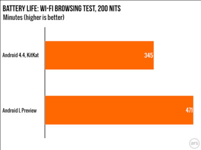
Android’s Project Volta was designed to optimize the OS’s performance on smartphones to improve battery life. Project Volta follows a pattern of projects run by Google focused on addressing weaknesses of the previous platform, such as Project Butter, which aimed to make Android’s UI animations run at 60 fps, and Project Svelte, an effort to get the OS to run on 512MB of RAM. In previous versions, when the OS is engaged in a process for one second, it burns two minutes of standby time. To address this, Project Volta includes the development of a “JobScheduler” API which allows the OS to batch unimportant app requests, and gives developers the option to delay housekeeping functions on their apps until the device is plugged in. ArsTechnica did a study of the Android L Preview battery life versus Android 4.4 KitKat and found that Android L Preview had 36% more battery life.

 androidL

Via Ars Technica

Another major move in the Android L Preview is the transition of the default run-time from Dalvik to ART, which aims to save battery life and yield a faster, more efficient performance. Animations and scrolling felt both faster and smoother, but there were some bugs with the multitasking view and notification tray which one can imagine will be fixed in the final version of the OS.

App compatibility with the new OS fluctuates, some work fine in the Android L Beta, while others don’t work at all, including Twitter, Dropbox, and Google Docs. Of course, we expect much of this to be ironed out in the final version of the OS. The bottom line for Android developers is that Android L represents a major improvement in battery life, aesthetics and performance, which is good for business.

At Mystic Media, we’re highly experienced in the Android app development field, with a thorough and continually evolving perspective on the ins and outs of the platform. Contact us today by clicking here or by phone at 801.994.6815