Tag Archives: UX

Part 2: Optimize Onboarding with Gamification

How Gamification Can Boost Retention on Any App Part 2: Optimize Onboarding with Gamification

The Mystic Media Blog is currently endeavoring on a 3 part series on how gamification mechanics can boost retention on any app—not just gaming apps but utility apps, business apps and more. In this second entry, we explore how to refine and gamify your onboarding process to keep customers coming back.

ONBOARDING

Your app has been downloaded—a hard-fought battle in and of itself—but the war isn’t over; the onboarding process has just begun.

App onboarding is the first point of contact a user has within an application. It’s one of the most crucial parts of the user experience. Situating users in your application is the first step to ensuring they come back. Twenty-five percent of apps are only opened once after being downloaded. Many apps simply do not make it simple enough for users to understand the value and get the hang of the application—step one in your retention process.

Here are the top tips for smooth onboarding:

MINIMIZE REGISTRATION

A prolonged registration process can turn off new users. Users do not always have time to fill out extensive forms and can quickly become resentful of the pacing of your app. Keep registration to a minimum, minimize required fields, and get users going faster.

We recommend enabling user registration altogether with “Continue as Guest” functionality. Games typically employ this and it enables users to get hands on with the application before they undergo the tenuous account creation process. Hook them with your app, then let them handle the administrative aspects later. Account creation with Google, Facebook, or Twitter can also save quite a bit of time.

Gamification is all about rewarding the user. Offer users an incentive to create their account to positively reinforce the process and you will see more accounts created. If they haven’t created an account, make sure to send prompts to remind them of what the reward they are missing out on. As we detailed in our last entry, FOMO is a powerful force in gamification.

TUTORIAL BEST PRACTICES

When a user enters your application for the first time, they generally need a helping hand to understand how to use it. Many games incorporate interactive tutorials to guide the user through functionality—and business apps are wise to use it as well. However, an ineffective tutorial will only be a detriment to your application.

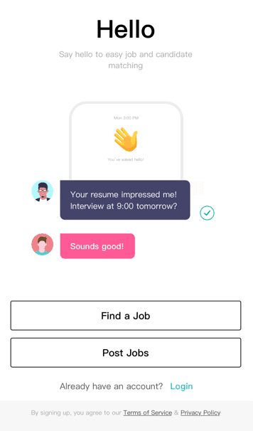
Pacing is key. A long tutorial will not only bog the onboarding process down, too much information will likely go in and out of the user’s brain. Space your tutorial out and break it into different sections introducing key mechanics as they become relevant. On-the-go tutorials like the four-screen carousel below by Wavely help acclimate users quickly and easily.

And don’t forget to offer a reward! Offer users some kind of reward or positive reinforcement upon completing tutorials to encourage them to continue using the application.

AVOID DEAD ENDS AND EMPTY STATES

An empty state is a place in an application that isn’t populated with any information. For example, favorites, order history, accomplishments, etc.—these pages require usage in order to be populated for information. New users will see these pages and become confused or discouraged. Many applications will offer self-evident statement such as “No Favorites Selected”. Or, in the case of UberEats below, no message is displayed.

It’s confusing and discouraging for users to see these statements. Avoid discouraging your users by offering more information, for example: “Save your favorite restaurants and find them here.” Check out Twitter’s exemplary message for users who’ve yet to favorite a tweet below.

CONCLUSION

Onboarding is the first and most crucial step to building a relationship with your userbase. One of the major things business apps can learn from gaming apps is that time is of the essence when it comes to capturing a user’s attention. Keep it short, punchy, and to the point.

SEO Pro Tips: Best Practices for Meta Descriptions

Last week, we explored the art of perfecting title tags for SEO dominance. This week, we’ll explore another vital meta tag: the meta description.

The meta description is the text that appears below the link in SERPs, as below:

via Word Stream

Meta descriptions should be about 135 – 160 characters long, although Google has tested longer snippets. Any time quotes are used in the meta description, Google cuts the text off. To prevent meta descriptions from being cut off, it’s best to remove all non-alphanumeric characters.

Google uses meta descriptions to pull preview snippets on SERPs and return results when searchers use advanced search operators to match meta tag content, but unlike title tags, meta descriptions do not directly influence Google’s ranking algorithms for normal web search since meta description keywords are not ranked.

While meta descriptions do not directly affect SEO, they do indirectly impact it. The prominence of meta descriptions in SERPs makes them a very valuable UX component and a tool for enticing searchers. While keywords do not affect ranking, they are bolded in the meta-description, which attracts the eye and can help influence a searcher’s decision to click. Thus the use of keywords in meta descriptions can be beneficial to increasing Click Through Rate (CTR). The Click-Through-Rate is the ratio of searchers who click on a page compared to how many searchers see it. CTR is highly valued in search rankings. Since meta descriptions are one of the first things that a searcher will see, they can influence them to click, increasing CTR and boosting SEO.

The ideal meta description articulates the value proposition which a company or web page offers in a precise way while taking into consideration the competition that the page is up against in SERPs. It assumes an active voice and includes a call to action. Web developers can enrich a meta description by using schema markups like star ratings, customer ratings, or product information, to increase the appeal. See below for example:

Image via Google Support

Sometimes meta descriptions are unnecessary. Moz advises if a page is targeting between one and three high volume search terms or phrases, it’s best to write a meta description targeting users performing those searches. If the web page is targeting long-tail traffic (three or more keywords, like a blog with hundreds of entries), it may be best to let the search engines extract the relevant text from the site since they will pull text specifically targeting the user’s search. A blog might be targeting one audience in their keywords, but have content on so many topics, they can be found through any number of search terms. A meta description specified for a page with a lot of content may detract from the relevance that the search engine can create organically by pulling a text description from the page which is relevant to the specific search.

Like title tags, repeating meta descriptions or making them incomprehensible will result in penalization from Google. Meta descriptions can be tricky since they are longer and a bad meta description can be worse than none at all. With the right title tags and website content, meta descriptions can be a major UX tool to drive traffic to a web page.

Nougat OS: Everything You Need to Know Android’s Latest Treat

With all the fuss about iPhone 7, iOS 10 and the new Pixel, it’s easy to forget Android recently unveiled their latest OS: Nougat. In line with Android’s other dessert-themed software titles (Marshmallow, Lollipop, KitKat, etc.), Nougat is a treat. It’s a refined version of Marshmallow with improved UX, specs and a lot more. Both iOS fans and app developers take note, here are Android Nougat’s top features:

MULTI-WINDOW MULTITASKING

The most notable feature of Nougat is Multi-Window Multitasking. Unlike iOS, Nougat allows users to run multiple apps on their screen at once, allowing users to watch a movie while they text, view a recipe while they keep their eyes on the timer, or use any number of applications. Multi-Window Multitasking can be utilized with three display options: Split-Screen, Picture-In-Picture and Freeform Mode.

Split-Screen mode splits the screen across the bottom when held vertically, or across the middle when held horizontally.

Picture-In-Picture mode will be optimized for Android TV and will eliminate the controls and interface elements while keeping the content portion to scale.

Freeform mode will allow users to customize the size of each application, like one can with a desktop or laptop computer.

REFINED NOTIFICATIONS SETTINGS

Notifications Settings via How To Geek

Android has always been a major advocate of customizing notifications, and Android Nougat improves their system. Users customize their quick settings to ensure they are only alerted to the top-level notifications. Users can also maintain conversations within the notifications bar to make it easier to chat without having to go back and forth into apps.

Bundled notifications allow users to see what is happening within their apps at a glance without clogging their feed. Simply tap to expand the box and view more info without going directly into the app.

FASTER PERFORMANCE, MORE BATTERY, LESS MOBILE DATA

The best improvements of Nougat OS are not flashy new features, but overall improved functionality. Google’s “Project Doze,” designed to increase phone battery length, was introduced with Marshmallow, but gets a big upgrade with Nougat. Doze shuts down CPU and network activity while the phone screen is off. Previously, Doze only worked when the device was motionless, but now it can operate whenever the screen is off.

Data overages can add up quickly. Google seeks to counter the threat of overages with Data Saver, a program which kicks in whenever the user is on a metered data connection and limits apps and background processes to a set amount of data. Rather than cutting off data usage at a  preset limit, Data Saver makes Android phones more efficient with constant refinement.

Both Data Saver and Project Doze are bolstered by minor technical improvements to Project Svelte, Android’s device optimization initiative, creating a more efficient phone.

SEAMLESS UPDATES

Android isn’t trying to reinvent the wheel. Their Nougat OS functions primarily as a UX improvement over Marshmallow. Android has instilled major security improvements, including file-based encryption. Android has also taken a page out of the Chrome OS playbook by adding seamless updates, which will allow system updates to install in the background.

NEW EMOJIS

On the lighter side of things, Android has installed 72 new glyphs and has revamped their 1,500 emojis to appear more realistic. Nougat is also compatible with Vulkan API, which opens up a world of low-overhead graphical possibilities.

WHEN CAN I GET NOUGAT?

As with any Android update, the real question is: when is it coming to my phone? Nougat is out, but device fragmentation on the Android platform entails a staggered availability based on the hardware. While Google’s Pixel phone could soon alleviate some of these fragmentation problems, Android still cannot move at the speed of iOS—but Nougat’s improved functionality is a welcome addition for both app developers and consumers.

For a full list of Android Nougat release dates, check out this awesome article over at Pocket Lint.

Rise to the Top of Google SEO with Responsive Design

When designing a website, web developers have both practical and aesthetic concerns. From a practical standpoint, a website must reach and connect with its core audience. Due to the rise of mobile technology, it’s important for a site to have mobile functionality so that it can reach the multitudes surfing the web on their mobile devices. The most efficient, cost-effective & effective way is to develop a responsive website. Responsive design not only helps reach a mobile audience, it also increases overall SEO so that the website will rank higher in search engines.

For those unfamiliar with responsive design, check out this quick 60-second review:

When it comes to SEO, Google is king. As of October 2015, studies show the massive tech titan owns about 63.9% of the search engine market share. In February 2015, Google announced they will be emphasizing mobile-friendly search results. In their own words: “Starting April 21, we will be expanding our use of mobile-friendliness as a ranking signal.”

In accordance with their announcement, Google Adwords charges less for a keyword when the landing page is optimized for mobile. Responsive websites represent a major incentive for advertising on Google since responsive design guarantees presentation will accommodate the device regardless of whether it’s a mobile device or a computer.

Responsively designed sites offer a common landing page for all devices, consolidating the amount of links and improving the SEO. If a desktop or laptop user iMessages the link to an iPhone, they can click on it and immediately prompt the same web page rather than a different page optimized for mobile. Instead of duplicating content with separate sites for mobile and desktop mediums, responsive design ensures brand and information continuity with a singular master site.

According to Sociomantic, over half of online shoppers use more than one device. A responsive website not only ensures a consistent UI and brand experience, it eliminates maintenance cost by reducing the amount of websites one is required to maintain. The better a site is, the lower the bounce rate is, and the higher it will rank in Google. For businesses looking to succeed, responsive is almost always the best form of web design.

Mystic Media is a web design and application development company based in Salt Lake City, Utah and specializes in responsive design. For more information, click here or contact us by phone at 801.994.6815.

How Material Design Redefined Android App Aesthetics

In the ongoing war of the operating systems, the front-runners are undeniably iOS and Android. As we detailed in our Android L Vs. iOS 8 article, Apple took the latest battle; however, Android Lollipop represents a major step forward for the platform as it introduced the aesthetic concept of Material Design. We’ve covered the principles of flat design in Impervious Appeal: How to Design Jaw-Dropping iOS Apps, but we’ve never gone in-depth on Material Design because it’s fairly complicated. In this article, we’ll detail what Material Design is and why it represents a huge step forward for app design aesthetics.

What is Material Design? It defies a simple explanation. It is similar to flat design in that it emphasizes negative space, bright color schemes, and an emphasis on intuitive UI. Material Design differs from flat design in the way in which it evolves the concept.

Material Design takes the visual aesthetic of flat design and asks the developer to create a realistic digital world with physical rules within the UI. Material Design offers designers the help of two skeuomorphic concepts: depth and shadow.

Depth and shadow both play a big part in how the user interprets what’s clickable and what’s not. The buttons themselves interact with the touch. The whole concept plays off our ability as humans to recognize depth and perceive information hierarchies organized in the dimension of depth.

Below is a great video featuring Material Design in practice.

UI designers love Material Design because the addition of depth and shadow gives them more tools to convey purpose, meaning and order. It effectively evolves the concept of flat design. Grace LaRosa, senior experience designer at R/GA, said to VentureBeat:

“What’s newest and most of note, in my opinion, is how well documented and systematic the language is. After a long era of designers and developers creating Android experiences that often feel renegade or pieced together, Google have undoubtedly stepped up their efforts to standardize and improve the UI and UX across their app ecosystem.”

The problem with Material Design lies not to its aesthetic concepts, but the practicality of executing it within the Android platform. Android allows third-party companies to create hardware based in the OS, which creates device fragmentation. Not all Android devices run on the latest OS (Lollipop), in fact, some devices go back as far as four previous versions of the Android OS. Due to this vast discontinuity in Android devices, the adoption of material design will likely be a gradual, unlike the nearly instantaneous switch to the latest OS and OS aesthetics for iOS users.

As Grace LaRosa said above, Material Design does set-up a standardized UI/UX for Android developers to use across the app ecosystem, which will hopefully bring about more unity on the platform. Material Design is thus only a part of the solution to the problem which will ultimately limit its impact. It is designed to make for more consistent UI/UX across Android apps, but it won’t be adopted uniformly and thus won’t  single-handedly be able to transcend the device inconsistency in order to solve the unity problem.

Jon Wiley, one of the creators of Material Design, recently said in an AMA:

“I think a big challenge with Google Search in terms of experience is that it has often felt like a series of jump cuts in what is actually continuous. Material design gives us a framework we can use to do something closer to a scene change in a play, continuously moving from one state to the next. This can make it feel much faster and can also provide cues as to what happened when you touched something in the UI. It’s another step towards removing any speed bumps along the way to getting a good answer.”

Interesting to note that both iOS and Android seem to be striving for a more fluid sense of continuity in improving their platforms. For iOS, it’s functional device continuity, for Android, it’s aesthetic UX continuity.

Ultimately, it seems likely Apple will leapfrog past Android by building upon (or conforming to) the Material Design aesthetics in an upcoming iOS, which will then receive mass adoption as is the precedent with Apple OS’s.

For more information on Material Design, check out these awesome, in-depth videos from Google I/O 2014: Material Witness: How Android Material Applications Work and Material Design in Google Play.

At Mystic Media, we’re constantly engaged in various app design projects. Our expertise reaches across all facets of the industry, be it iOS design, Android design, web design, strategic marketing and more. Contact us today by clicking here or by phone at 801.994.6815

Android Lollipop Vs. iOS 8: The Battle of the Operating Systems

It’s been a good year for operating systems.

Back in June, Google announced their new operating system “Android L,” which has since been dubbed Android Lollipop. In our post  Android L Beta Preview: First Impressions of the Latest OS, we covered what we knew about the OS based on the announcement at the Google I/O 2014.

On the iOS side of the equation, this year saw Apple release iOS 8, which Apple hailed as the biggest iOS release ever. iOS 8 didn’t reinvent iOS aesthetics, rather it pushed forth the flat design introduced with iOS 7 and added a host of new features, including Apple Pay, Touch ID, and Device Continuity.

Both platforms represent dramatic technological advancements. The question now becomes: iOS 8 or Lollipop?

AESTHETICS

Steve Jobs majored in calligraphy at Reed College before dropping out. Jobs always held aesthetic design to be among the top priorities in his vision of Apple products, and Apple has always held a strong edge over Android in the aesthetic department.

iOS 7 saw Apple straying from Jobs’ skeuomorphic ideology in favor of Flat Design: a more stylized, minimal, bright look. iOS 8 refines Flat Design with more consistent iconography and UI. It also makes better use of gestures including swiping left to go back and double tapping the home screen to slide the screen down, allowing for better reachability on the large screens of the iPhone 6 and 6 Plus.

While Apple refined their current look, Android elected to enact a complete aesthetic overhaul. They may have shaken up the OS aesthetic game with Material Design.

Material Design is not an easy concept to grasp and can better be explored in practice. The idea is that the digital world should have its own intuitive physical rules. Buttons must react specifically to the touch, there must be multiple easily decipherable UI layers, animations must trigger and unfold in a specific, consistent manner. All Material Design aesthetics are in favor of creating the most intuitive, easily understood experience for the user.

Material Design is much more intricate than Flat Design. It’s both showier and more practical. It’s a more evolved, complex version of Flat Design. Thus, Android has taken the crown with regard to aesthetics. It’s likely Apple will follow suit and copy Material Design aesthetics for their next iOS overhaul.

Check out this video demonstrating the ideas of Material Design posted by Google Developers Youtube account.

FEATURES

Both Lollipop and iOS 8 offer new features, in addition to minor UI tweaks, for their devices. Most of these features either mirror their competitor’s counterpart, or replicate a past feature of their competitor.

Lollipop and iOS 8 both push to integrate with cars with Android Auto and Apple CarPlay. Both offer integrated navigation systems, hands-free calling and texting, and control of entertainment; however, neither will have a major impact until they are adopted by a greater number of cars.

Lollipop and iOS 8 both feature health apps (Google Fit and Health respectively). Both function similarly with certain apps offering exclusive partnerships. The big factor could be whether/which major health apps make the commitment to either Lollipop or iOS 8. The anticipated forthcoming popularity surge in wearables could be a game-changing variable in health apps. At the moment, neither app has a major edge over the other.

iOS 8 now offers Apple Pay combined with Touch ID, a replication of Google Wallet which was introduced in 2011. While Google Wallet is the older system, Apple Pay currently has the momentum. Both offer touch payments via Near Field Communications, but Apple Pay refuses to store physical credit card details, making it the safer system. The popularity of Pay could cause a resurgence of Google Wallet, but at the moment, Apple Pay has a definite edge.

Aside from the aesthetics, perhaps the biggest differentiator between iOS 8 and Lollipop is Apple’s push for the concept of device continuity embodied in Handoff. We covered device continuity in both Climbing Yosemite and Bite the Apple: Maximize iOS 8 to Vanquish Your Competition. Handoff allows the user to easily complete tasks while transitioning  between Apple devices seamlessly. Instant Hotspot, one of the coolest features of iOS 8, allows users to connect to their iPhone’s cellular network when no other Wi-Fi networks are available. Lollipop comes up empty in this department and Android will surely be playing catch-up when they release their next OS.

BATTERY

iOS bolsters a reputation for retaining a more efficient battery than Android. With Project Volta, Android has made a strong attempt to optimize their OS to defeat this notion.

Lollipop features a built-in task manager designed to prevent unnecessary operations from waking the phone up, running app house-cleaning necessities in batches when plugged in, and preventing network requests from Android and third party apps in spots without network connectivity. Lollipop also has “Battery Historian,” an analytics tool designed to track and tweak battery consumption.

iOS 8 did not make any dramatic attempts to improve it’s battery life, but still competes with Android with an extremely efficient standby mode: leaving an iPhone 6 or 6 plus unplugged overnight will only lose 1-2% charge.

Overall, the OS battery competition is fairly neck-and-neck, which is a big improvement for Android considering in the past they have gotten smoked in this department.

Check out this video Introduction to Project Volta from Google I/O 2014 for more information.

AVAILABILITY

One of the major factors which elevates iOS 8 over Lollipop is the limited availability of the OS due to device fragmentation.

Google allows third-party developers to build hardware for the Android OS. This causes device fragmentation, in which the variety of hardware makes it harder to optimize software for each device. As a result, different devices will have access to Lollipop at different times. Lollipop is currently available on Google’s Nexus 6 and Nexus 9 phones with a staggered launch planned for other Android phones.

Device fragmentation is also troublesome for app developers as it means there’s no way to optimize directly for all the hardware considering the diversity.

iOS’s iPhone exclusivity means it runs well across devices and updates are immediately accessible on Apple hardware. The user is guaranteed at least three years of upgrades. App developers can optimize for each platform which remains relevant.

BOTTOM LINE

Overall, iOS 8 is the more practical operating system. While Material Design represents an exciting leap forward in software aesthetics, iOS 8’s device continuity features trump all of Lollipop’s functional additions. The widespread availability of iOS 8 and lack of device fragmentation makes it the better optimized package.

While iOS 8 wins this battle, it will be exciting to see how the platforms influence one another in the next round of OS updates. Expect Apple to adopt Material Design aesthetics and Android to begin a push for their own version of device continuity.

At Mystic Media, we’re constantly engaged in various app design projects. Our expertise reaches across all facets of the industry, be it iOS design, Android design, web design, strategic marketing and beyond. Contact us today by clicking here or by phone at 801.994.6815

App Store Optimization Part 5: Key Differences in Apple Vs. Google Play App Stores

In an effort to emphasize the importance of App Store Optimization, The Mystic Media Blog is applying its expertise into a six-part series on ASO. In our previous entry Maximize Your Exposure by Getting Featured on the App Store, we detailed techniques on how to get featured on an App Store landing page. This week, we will explore the differences in ASO for Google Play and  Apple App Store.

App Store curators look to surface the most relevant content for users. Although the ultimate goal may be the same for both Google and Apple, their approach to achieving their goals are different. The exact details of Apple’s processes are shrouded in secrecy as they promote discovery through curation, while Google focuses more on analytics and prioritizes transparency in their processes. Check out their recent I/O speech on Getting Discovered on Google Play for a bevy of useful information. While our ASO series thus far has focused on the common ground, this chapter will delve into the differences between the two app stores and what techniques can be used to optimize for either store.

GENERAL THEMES

Google Play favors bigger mobile-focused enterprises, while Apple favors independent developers. A recent study at MobileDevHQ found independent developers generally rank higher in the Apple App Store, while Google Play is more favorable toward mobile focused enterprises. MobileDevHQ recorded the top apps for each store and found that 65% of the top apps for iPhone were independently developed, while 90% of top apps in Google Play store were developed by mobile-focused enterprises.

Granted, out-of-context, the above statistic can be misconstrued. Big mobile-focused enterprises do better on Google Play because they have the brainpower and workforce to analyze the statistics which factor heavily into Google Play’s search algorithm. Google Play also does its part to give independent developers an opening through regional-specific results and Google+ recommendations. Apple’s App Store, on the other hand, relies on curation. The Mystic Media Blog previously discussed  how Android is considered more developer-friendly since they feature open-source coding and skip the process of approval Apple uses to filter bad apps from making it onto their App Store (review our post on Why Android Rules the Mobile Application Market). Apps receiving approval before making the the app store filters out sub-par entries, allowing Apple to curate more effectively. Every app on the Apple App Store, big or small, starts with an evaluation.

Apple’s App Store is much more volatile and reactive to trends than Google Play. Within the same seven day study at MobileDevHQ, the top ranking apps in Apple’s App Store fluctuated—no single app stayed in the same rank through all seven days—while of the top ten ranking apps on Google Play, five failed to change position once. In addition, no new apps broke into the top ten for Google Play.

DESCRIPTION

While it’s recommended developers include keywords in their app description, the Apple App Store barely weighs the description, unlike Google Play which weighs the keywords in app descriptions heavily. For more on keywording and app descriptions, review App Store Optimization Part 2: Master the Art of Writing a Catchy Title and Effective Keywords.

VIDEO

Google Play also allows developers to post a video preview of their app. The purpose of the video is to show the app in use, to preview the graphics, the sound, the UX, the function, etc. Google Play preview videos are hosted through Youtube, which creates a new avenue for app developers to market their product through Youtube SEO. For more on the topic, check out this cool article on How Youtube Videos are Ranked.

DISPLAY

Google’s recent talk about getting discovered on Google Play yielded a lot of great information concerning Google Play’s display strategy. Ankit Jain, Google Play’s Head of Search, Discovery & Store Infrastructure, explained how Google Play attempts to create a UX which is simultaneously personalized and personal.

Personalized, as it relates to Google Play, means the results are catered to the user based on their history of searches, purchases, what device the user is on (remember, unlike iOS, Android allows third-party companies to develop  devices on its OS), and what’s popular in their geographic region. The amalgamation of user history and geographic popularity factor heavily into Google Play’s search algorithms.

Personal means results are annotated by Google Play analytics with reasons why the user should download the app. This involves linking to the user’s Google+ account to allow the Google Play store to show if anyone in a person’s Google+ circles has given an app a +1.  Apps relevant to a search which are recommended by people in a user’s Google+ circles will surface high in the search results, thus targeting Google+ for social media campaigns pays off for developers releasing through Google Play.

CONCLUDING THOUGHTS

The goal of any app store is to effectively promote the top apps for the platform. Both Google and Apple look to share the apps which will best please the user and make the most of the technology of their respective platforms. When it comes to ASO, no keyword, app title, icon, or description will change anyone’s mind about a bad app. No curator will elevate the status of a bad app because it is well-marketed. Thus, it’s fitting remind you: the first step to optimizing any app for an app store is to create a great app. By observing the rules of each app store and excelling in each of the processes of ASO with intelligent strategy and an efficient external marketing campaign, a great app can catch the attention of app curators and rise to the top of any app store search. The rest, as they say, is search history.

Mystic Media is considered among the most versatile and capable web agencies in the US. Our workforce includes experts across a variety of fields including app development, strategic marketing, social media, web design, Search Engine Optimization, radio streaming, and more. We have the resources necessary to effectively develop and market applications for any platform. Contact us today by clicking here or calling 801.994.6815

App Store Optimization Part 4: Maximize Your Exposure by Getting Featured on the App Store

In an effort to emphasize the importance of App Store Optimization, The Mystic Media Blog is applying its expertise into a six-part series on ASO. In our previous entry: “Boost Your App’s Profile, Increase Downloads and Generate Better Ratings”, we detailed the secondary factors which affect ASO, such as Ratings and Number of Downloads. This week, we will explore how to get featured on the app store landing page.

Intelligent ASO will bring you to the top of search-strings specific to your app’s functionality. However, imagine if rather than having to search, your app was presented to viewers the moment app store users go to the app store. Sounds like a dream scenario, but it’s entirely possible through clever ASO. Both Apple’s App Store and the Google Play App Store feature top-tier applications on their landing pages, as well as in several mini-categories.

The App Store curators are not looking to help developers out by featuring apps. They are looking out for the best interest of their company, which means pleasing the viewer. In order to satiate their customers, they showcase the coolest, most visually-engaging, best executed, most high-tech apps. Developers can take advantage of the curators’ needs by catering to their desires and utilizing the latest iOS and Android features in their apps. App Stores are much more likely to feature an app if it showcases the best features of their product.

Keeping up with the latest technologies is easier said than done in a constantly evolving landscape. With every OS update from both Apple and Android, the capabilities of devices are increased. Curators looking for the most high-tech apps must react to the OS updates and seek out apps which utilize the new technology to feature in the app store. Your app can fill that void. Stay up to date on the latest iOS update by reviewing our recent post Bite the Apple: Maximize iOS 8 to Vanquish Your Competition. Review our Android L Beta Preview: First Impressions of the Latest OS to plan ahead for the forthcoming Android L OS. If you’ve already designed your app, you haven’t missed out. Working the latest technology into an app update can also get the app featured. For example, Apple has been pushing the iCloud for all of their apps as of late. Finding some way of incorporating iCloud into an existing app’s software update would be beneficial for ASO.

In service of ensuring your app retains the look and feel of the most state-of-the-art technology, we recommend investing heavily in the User Interface and User Experience design. Perhaps the most important aspect of any app, poor UI/UX design will both alienate customers and guarantee your exclusion from the app store. Great UI/UX design will charm your customers and make your app look state-of-the-art. The details which go into an app’s gestures and audio make or break an app in the eyes of the critic, while retaining the potential to dazzle an audience. When directing your UX designers, be sure to take into account the branding for device-specific apps. If you’re releasing your app on iOS, review Impervious Appeal: How to Design Jaw-Dropping iOS Apps to make sure the UX design is consistent with Apple UX aesthetics, including “flat design.” The upcoming Android L OS specifically pushes Material Design aesthetics in an effort to distance the look of Android apps from those of iOS. Check out Android’s official Guide to Material Design for Developers to learn more. Impressive UX is debatably the most important aspect of any app, but it’s especially vital in the eyes of app store curators looking to show off the graphics capabilities of their devices.

Check out the screenshots below which detail the process of how Transit, an app which aggregates public transportation information, developed their UX design through multiple drafts. In 2012, Apple announced they would develop their own Maps app to replace Google Maps on iPhones. Instead of creating public transit functionality from scratch, Apple found it cheaper to buy Transit, an already successful app, and utilize its functionality. Now under Apple, Transit’s quest to perfect UX which would seamlessly integrate with Apple’s evolving aesthetics is a great example of aesthetic adaptation and the process of developing UX.


Via blog.pickcrew.com

With over 1,000 app submissions per day, standing out in the sea of content within the app store can be a challenge; however, a great app will find its audience if properly marketed. While ASO is vital, it must be only one facet of any app’s marketing campaign. The app store curators react to trends. If an app gets external publicity, they are more likely to feature it. This works against independent developers who generally don’t have the same budget for marketing as they do for app development. Established brands stand a better chance at getting and staying featured. But independent developers can still find their niche. The app store curators are taste-makers looking to please their users by offering the best apps the exposure they need, as if they were curating a critic’s “Best of” list. The curators do not want to give the viewer the most obvious choice, but rather the best-in-class. Thus, a great app can transcend limitations.

Developing multiple native applications catering specifically to both device and OS improves your chances of success in all facets of app design, including ASO. Review Making the Most of your Tablet Design Part 2: Custom Device Design to learn more about the benefits of custom device design. App stores are more likely to feature apps which are available and optimized not just for smartphones, but also for tablets and computers as well. The more app stores on which your app is available, the more places it could get featured. Staggering your launch to start exclusively on one app store can also work toward your advantage because Apple and Google are more likely to feature apps exclusive to the Apple App Store or Google Play App Store respectively.

There are no rules the curators of the app stores must follow. They live in the shadows seeking out the best apps to showcase the full potential of iOS and Android smartphones, tablets, and computers. As we’ve stated before, ASO starts and ends with a great app.

Next week, in Part 5 of our series on ASO, we will detail the differences between the Apple and the Google Play App Stores. Stay tuned!

At Mystic Media, our teams of expert application designers and strategic marketers have the means to effectively both develop and market apps for iOS and Android. Contact us today by clicking here, or by phone at 801.994.6815

Game Up: Employ Top Gaming App Design Trends for a Killer End User Experience

Mobile gaming is one of the most widely utilized functions of a smartphone. Studies show the average user spends 7.8 hours in the average month on mobile gaming. iPhone owners account for 14.7 hours per month, while Andro